When I've wanted ideas for quilts, I've looked online, and very much appreciate those many people who have taken the time to post their quilt pictures. Here's my contribution.
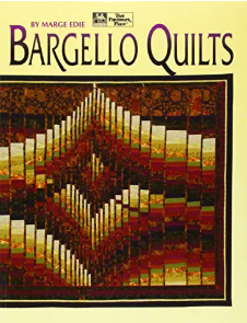
Some quilts I like, some not so much, but I didn't have the vocabulary to say what I liked. So, I browsed through some quilt books. Right away found a book with lots I liked:

Next, off to the quilt shop. Thousands of choices! Ah, there was a group I liked more than all the others, the batik fabrics. I didn't even need to look at all the little flowers and prints of car license plates. Now I hardly look elsewhere and have the words--cotton, batik--to limit the options for buying fabric online (the local shop closed). I've also used some tie dyes.
The general technique for bargello quilts is to choose, say, 12 colors from light to dark, which comprise a color "run." Cut uniform strips of each (say, 2" so the finished height of the pieces is 1.5") and join the strips. Then you cut the connected strips to the desired widths. The strip widths vary to make curves. The directions, then, are things like "cut a 3-inch wide strip of colors 5-12."
This particular pattern, named Fractured Rhapsody, also has an unpieced strip (the fracture) between each row. I figured this would give me a bit of wiggle room, because it wouldn't be so critical to have all 4 corners join neatly. Some bargello designs have the rows offset by half a height (like the running bond of brickwork), which would likewise make for not having to have the corners all match up. However, it's easy enough to match corners because of the ridges made by the folded seams. For all of these, a tip from the book: When you stitch the strips together, sew up one seam and down the next.
I had it and the next two quilts minimally quilted by the local shop. Here's the quilt, about 47 x 37". I like that the tip top extends into the border. This a design that works upside down, too.

Next was a larger wall quilt (about 50 x 60"), again from Marge Edie's book, named Fireflies. Found that that medium purple line was more eye-catching than I planned, so learned something. Since the purple quilt had departed for one son's apartment, did another to keep. This one uses the same pattern, but I reversed it right to left and also made it smaller.
I realized that I didn't like the other patterns in the book nearly as much as the two I made. As I got looking around at other bargello quilts (Google Images is helpful), realized that the appeal was the regularity of the bargello PLUS some extras, some overlaps, some discontinuities, some bits that almost look like mistakes. They make the quilt more interesting. It was time to try some design.
A bargello quilt is made of rectangles. I could limit myself to rectangles arranged with four corners together, like a checkerboard, instead of rectangles lined up like bricks. Because of that limitation, I could use a checkerboard made of rectangles. The next question was how to sketch and plan, on the computer, easily. These quilts don't lend themselves to moving pieces around on a design board.
Aha! A suggestion! An Excel spreadsheet has rows and columns of rectangles. I would keep all the the row heights the same, then adjust the column widths by pulling on the column dividers across the top. After the design was roughed in, I could adjust the row height to what I wanted, usually 1"-2". Then I'd work on the column widths, which would vary; I used column widths of 3/4" to 4". In the spreadsheet, I set a row height of 24 units and column width of 4 units to be a square, which I would translate as a 1" square. (This changed a bit with time.)
Then, I made a column of, say, 12 cells, numbered 1-12. Then I filled them in with 12 colors, approximating what I would use. Next, I'd reverse the column so color 12 was on top. Then I could copy and paste the color runs to make a design.
You've seen those bargello quilts that look like waves? It's all done by adjusting the column widths. Here's a spreadsheet to play with:
Making wavesBargello lends itself to curves, so it's mostly abstract but can be something like mountains and stars. To get started on a little wall quilt (29" x 42") I thought of something hill-like on one side with sky above. There are 15 colors in it, but I didn't use color runs that long.
Spreadsheet for small landscape bargelloThe finished quilt has not quite enough contrast in the mid ranges: learned something. Tip: Have the spreadsheet colors about as contrasty as the fabrics.
I had a place to put another quilt, and felt it was time to design something complex. Bargello is great for sweeping curves and those concentric diamonds sometimes called gods-eyes. So, I made a few of these then worked in some trailing lines for interest. I ran 12 colors, not only from light to dark but from brown to green. The 27 rows x 50 columns ended up at about 35" x 59" with the border. There's a photo of the sanity check before the strips were sewn together. I hand-quilted it.
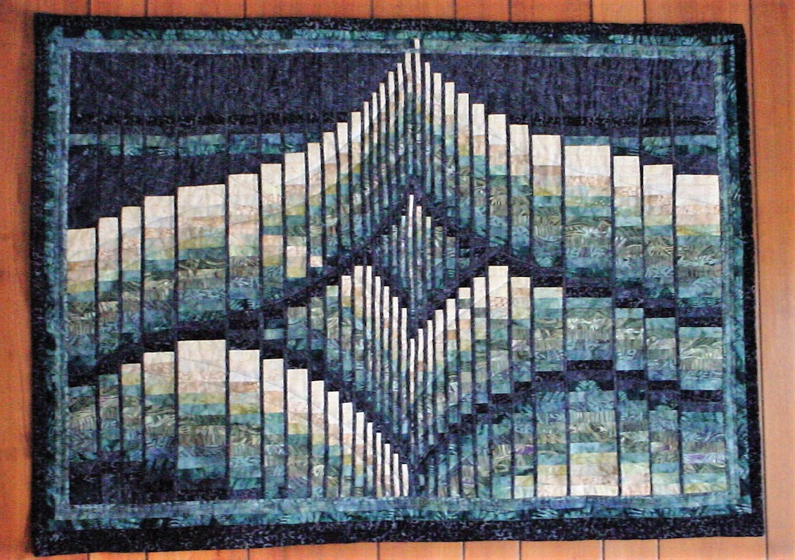
Spreadsheet for bargello quilt in greens and tansThe Marge Edie book shows a bargello quilt that looks like a wide ribbon curving here and there. I liked it, and I liked that much of the background was plain; I was ready for a faster quilt. Given that inspiration, I designed this ribbon quilt. The idea is that the inside of the ribbon has pale tans, while the outside is darker, with blues and greens. The black background contrasts both. I staggered the seams in a few places to make very steep curves; to do this on the spreadsheet I had 2 rows = one quilt row. I also played with to see if it looked better lit from the top or the bottom; clearly it needs to be lit from the top. I hand-quilted the ribbon area but it might have been less obtrusive to stitch in the ditch, vertically. My hand quilting makes the fabric pucker, possibly because my stitches are far apart. For the black background, I ran lines of machine stitching up and down, up and down.
Spreadsheet for ribbon quilt lit from bottom
I like blue. Bought a few packages of assorted indigo batik and tie-dyed cottons. The fabric patterns are too large and too contrasty to use in bargello quilts, but I enjoyed gazing upon them. About that time, we decided to spruce up a guest room. Thus, we could use a bedspread, and let's use those blues.
I'd seen some quilts that had enough randomness + order to be interesting, with squares and rectanges of modular sizes arranged in irregular ways. I figured that sizes of 3" and 6" would capture the patterns well, threw in the finished size I wanted, and cut about the right number of squares and rectangles. One fabric had a motif to capture, so made that in a frame so that it would fit amoung the 3" modules.
There was no need to do a mock-up; I could simply arrange the fabrics on the floor so that it looked nice. I had a bedsheet with a wide grid pattern, so put that on the floor first for guidelines. When things looked good, I pinned and seamed subsections and eventually the whole thing. Some tie-dye fabric was used for the border. This one I quilted with my home machine, stitching in the ditch.
Next made a long quilt for above the bed, with uneven, geological blue layers. I used a quilt-as-you-go technique for this one.
By now I had a stash of quilt fabrics in color gradations from pale blue to dark blue, pale to dark blue-greens, tans to dark browns, greens light to dark and blue-greens to yellow-greens, and quite a few pale to dark purples to blue-purples and green-purples, etc.: decent gradations in many directions. I could make another few quilts without buying more fabric.Searching for images of batik quilts turned up a few that played with color in appealing ways, using the color gradations I had and enjoyed.
This long quilt started with me arranging nearly all of my stash fabrics, still uncut, with color gradations working in all directions. This was a proof of concept; I had enough colors to do this and these were the ones to use. Then I cut one large and one small square of each color (finished sizes of 2.25" and 4.5"). I arrayed the larger squares in color gradations, then put the corresponding smaller squares about 180 degrees away. Then, I stitched and quilted by machine, in the ditch.
One type of quilt that caught my eye repeatedly looks a bit like a photo with a glare of light in the middle. Really, though, the quilt has pale pieces at the focal point with gradations of color going out from that. They are sometimes called "colorwash" quilts.
I noted that the quilts I saw used about 300-500 squares (or rectangles) to make it work. With the finished size I had in mind and the ~150 colors I had available to use, it meant a few squares per color. (Pale colors would need fewer squares.) I wanted this to be small, so made the finished squares 1.25". Again I arranged pieces like a jigsaw puzzle until it looked good, recalling that often it's better to have the focal point off center. I hand quilted it, but perhaps machine stitching in the ditch would have been better.
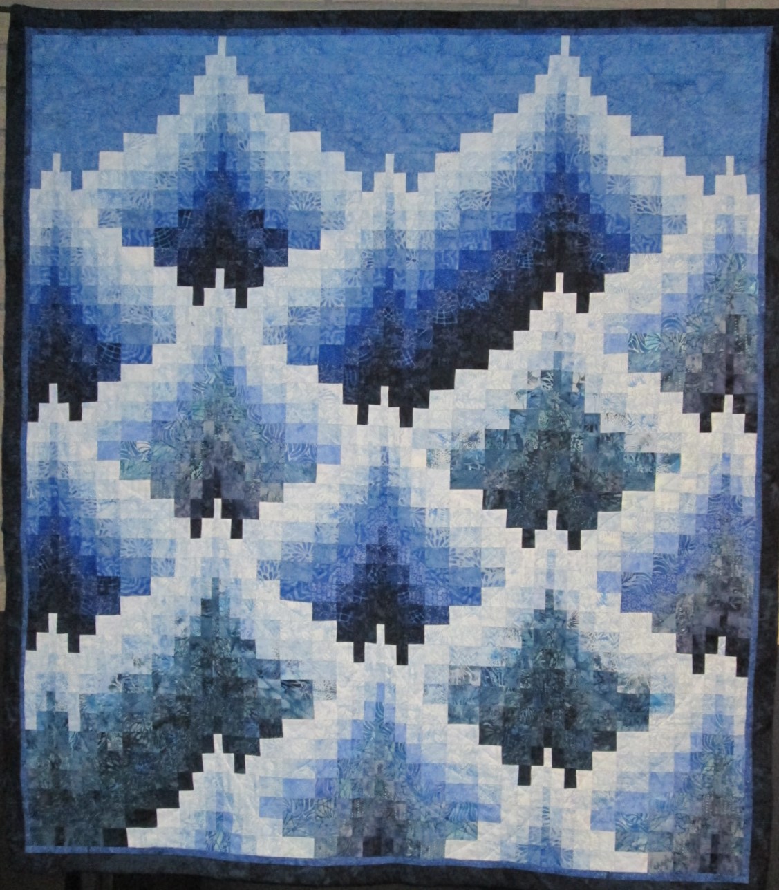
I was ready to do another quilt that would take hours of planning. I played with spreadsheets and eventually came up with the idea of making a "mountain range" of shades of blue. It's all progressions from light to dark, marching up and down. Each fabric has some color variation, so in some places the progressions aren't as subtle as other places. Some squares I corrected late in the process. Each row is 1.25"; the whole thing about 4' wide. I considered making it longer but ran out of interest.

For a second colorwash quilt, I am cooperating with my quilting sister. We each cut 2.25" squares from our stash of batiks, saving some squares for ourselves and cutting some the other sister. Now we each have a pile of squares to work with, about half of unfamiliar fabrics. It will be interesting to see how the quilts differ.